UI Kit Builder
Design a whole game screen as one concept, then turn it into separate, named, engine-ready UI elements. Buttons with their states, panels with 9-slice borders, icons, bars, and frames, all cut from one consistent design.
The flow runs in order: concept, component sheet, slicing, 9-slice borders, export. Each step builds on the one before it, and you can go back at any point.
Why it starts with a concept
UI elements generated one at a time drift apart: each button gets its own idea of lighting, outline weight, and corner radius. The builder generates the entire screen first, where every element has to agree with its neighbours, and only then rebuilds the pieces from that approved design. The concept also stays with the kit afterwards, as the style reference for every later request.
Start from a style, a description, or your own mockup
Open the UI Kit Builder. Three ways in: click one of the example styles to start with its look already filled in, describe your own from scratch, or upload a screen you already have. An upload skips concept generation entirely and goes straight to breaking the image into parts, so it also works with mockups made outside SpriteCook.
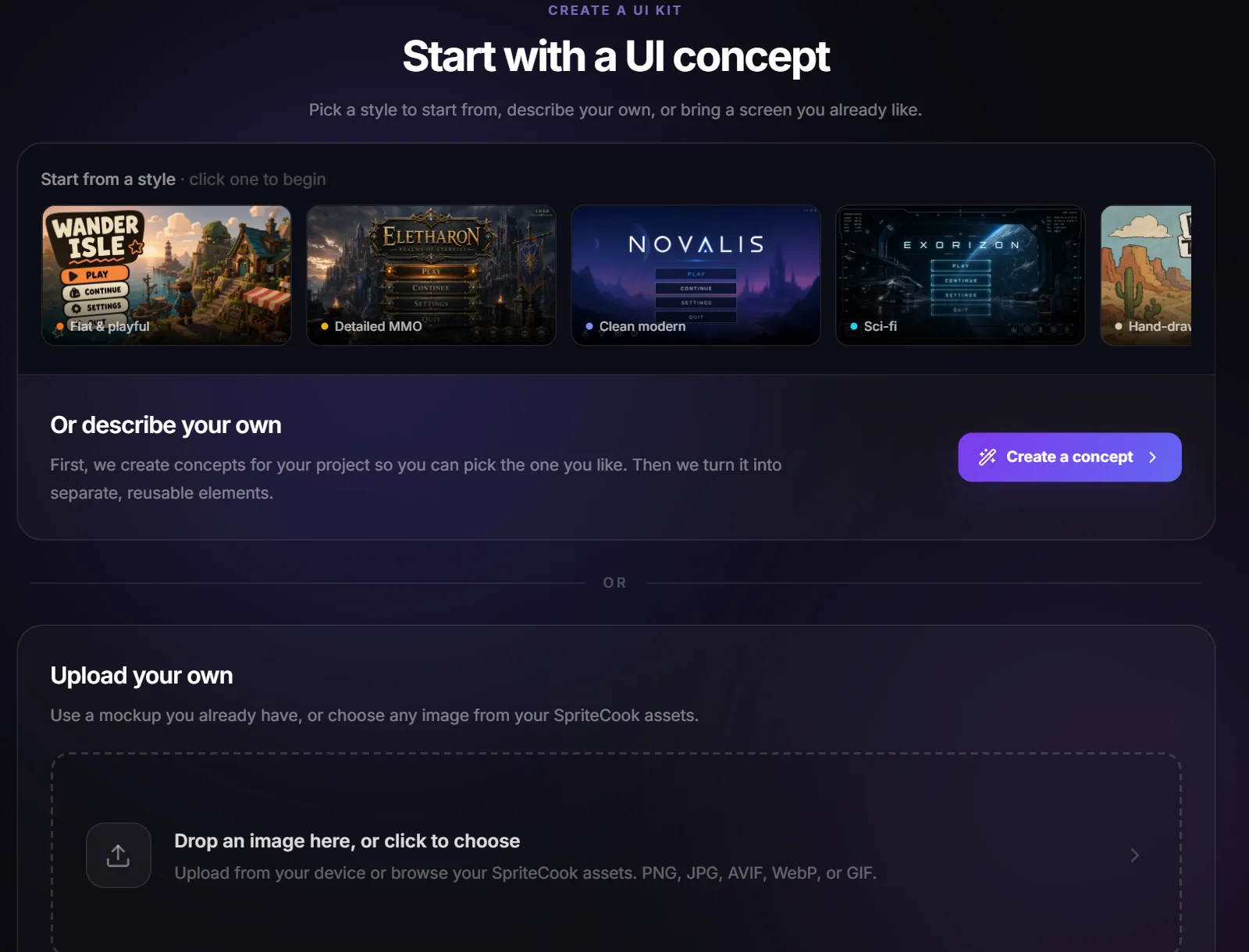
Once you have kits, this screen shows your recent ones first so you can pick up where you left off.
Pick the screen
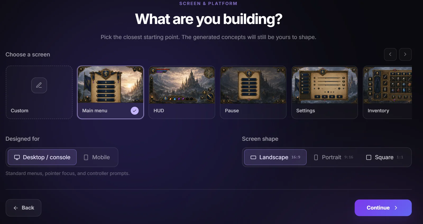
Choose what you're building: main menu, HUD, pause, settings, inventory, dialogue, shop, quest log, character select, map, or game over. Custom lets you describe any other screen in your own words. Then set the platform (desktop and console, or mobile) and the screen shape. These steer the concept's layout, control density, and spacing.
Describe the look
This step decides what the whole kit looks like, so it has the most controls. All of them except the style description are optional.
What's your game?
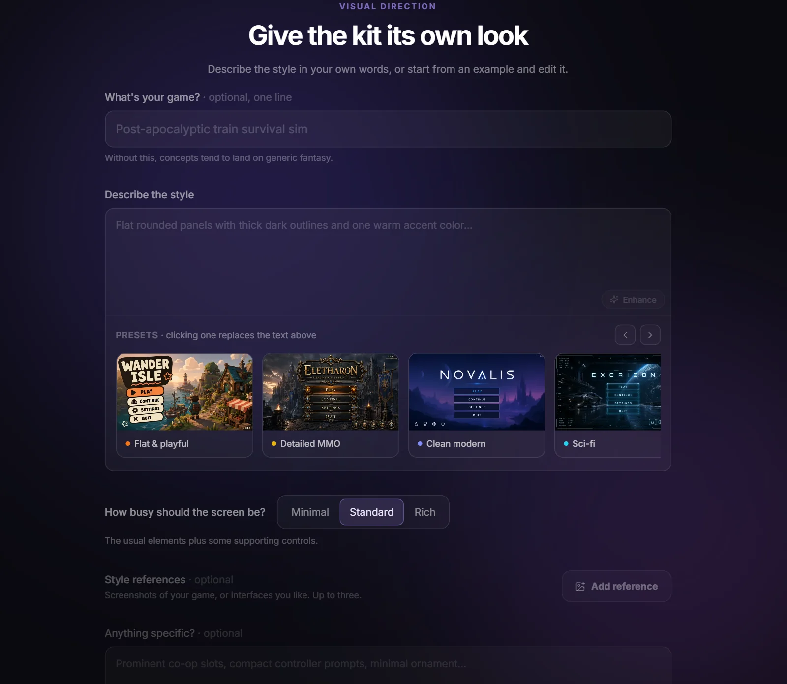
One line about the game itself. With it, icons, wording, and any background scene fit your game. Without it, concepts tend to land on generic fantasy.
Style description
The look in your own words. Clicking a preset fills in its exact text so you can edit from there. The Enhance button rewrites a rough note into a fuller description, using your game line as context.
Density
Minimal, Standard, or Rich. How busy the screen should be, from just the essentials to status widgets and meters everywhere.
Style references
Up to three images: screenshots of your game, or interfaces you like. There's also a button that writes the style description from them for you.
Anything specific?
Your own direction, like "prominent co-op slots" or "toon pill buttons with a black edge". When this conflicts with anything else, your direction wins.
Save to project
Everything the kit generates lands in a project. By default we create one with an editable name; you can also pick an existing project, and the kit gets its own collections inside it.
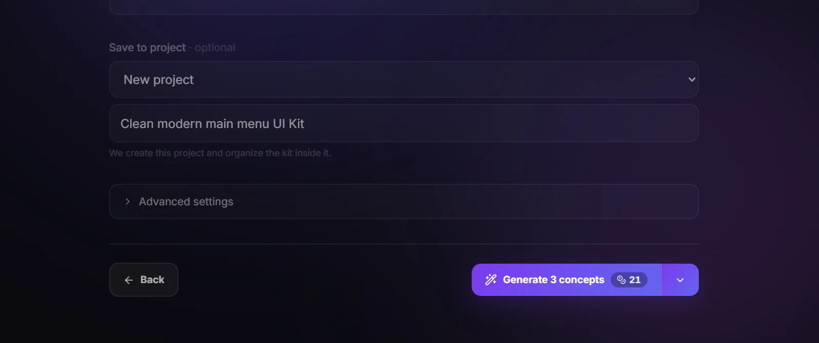
Under Advanced settings you can switch the concept model. GPT Image 2 is the default and our recommendation; Nano Banana 2 and Nano Banana Pro give a different look at their own credit costs. Component sheets always use GPT Image 2, since it is the most dependable at drawing cleanly separated pieces. The arrow next to the generate button picks how many concepts you get, one to three.
Pick your favorite concept
The concepts arrive as full screens. Click one to select it, or the corner button to see it at full size. Ignore any garbled text in them: text and numbers are removed later so every piece stays reusable, and your engine renders the real strings.
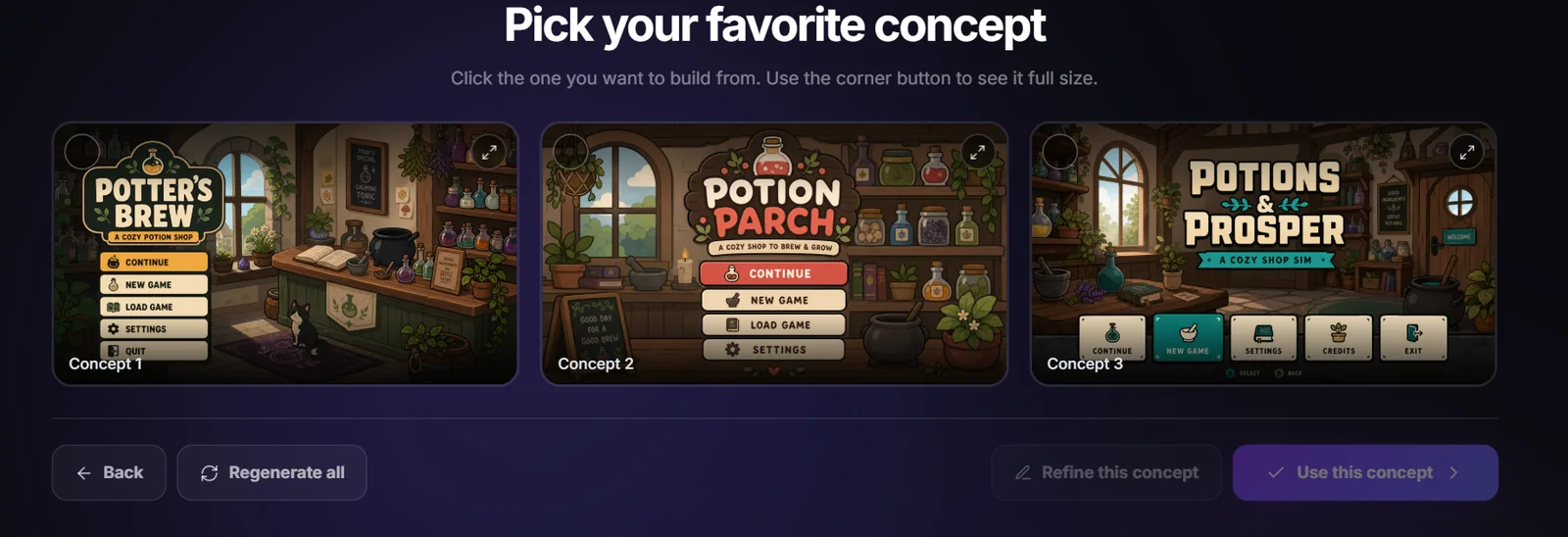
Two ways to iterate. Regenerate all makes a fresh batch, with an optional note about what should change. Refine this concept edits the one you selected: "make the buttons wider", "move the event card to the bottom right". Every take stays in the grid, so you can refine as often as you like and still pick an earlier version.
Break it into reusable pieces
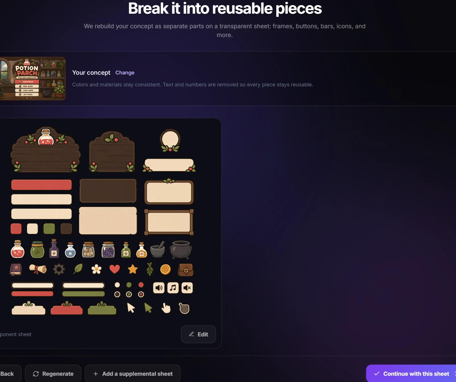
The builder rebuilds your concept as separate parts on a transparent sheet: frames, buttons, bars, icons, and more, each drawn fully and cleanly apart so they can be cut out. Before generating you choose how much the kit should include:
- • Visible components only rebuilds what appears in the concept. Faster and more compact.
- • Complete interaction states adds hover, pressed, disabled, on/off, selected, checked, and empty/fill families for every control.
- • High resolution renders a 4K sheet instead of 2K, so every piece has about twice the pixels. Available on the Adventurer plan and up.
- • Only need part of it? scopes the request, like "only the buttons". You get one sheet with just that.
Busy concepts get split across up to three sheets automatically so every piece stays large and readable. When a sheet comes back you can regenerate it with feedback, request targeted changes to one sheet, or add a supplemental sheet for anything that came out wrong or missing.
Check the detected components
Every piece on the sheet gets outlined automatically. Move, resize, add, merge, or delete boxes until each one holds a single component; the min size and merge gap settings tune the detection itself. Smart alpha is on by default, which trims each cut to its own shape so a neighbour's pixels never leak into a slice.
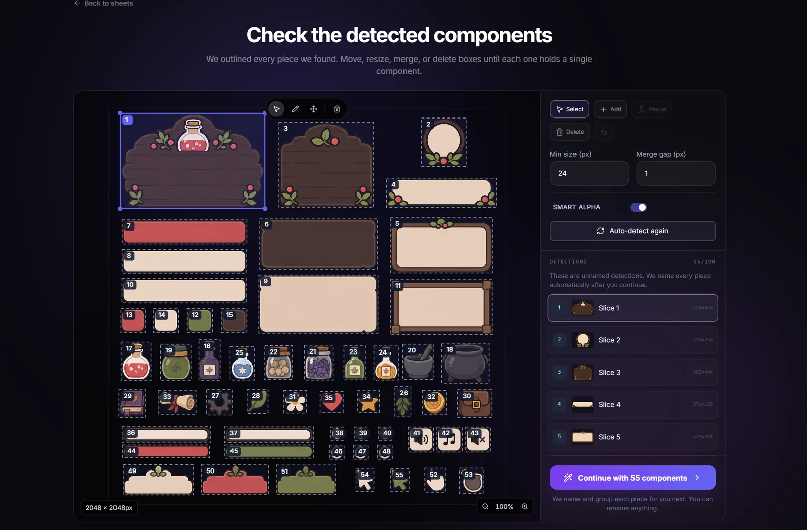
When you continue, every piece is named and grouped for you: "gold_square_button" with its hover and pressed states in one family, panels and tracks marked as scalable. You can rename anything.
Set how each piece stretches
9-slice borders keep corners and edges crisp when a panel or button changes size: the four corner areas never scale, the edges stretch along one direction, and the middle fills the rest. Drag the guide lines just inside the decorated corners, or hit Suggest for an automatic estimate. A live preview lets you stretch and squash the piece to see the result, and one checkbox applies the same borders to a whole state family at once.
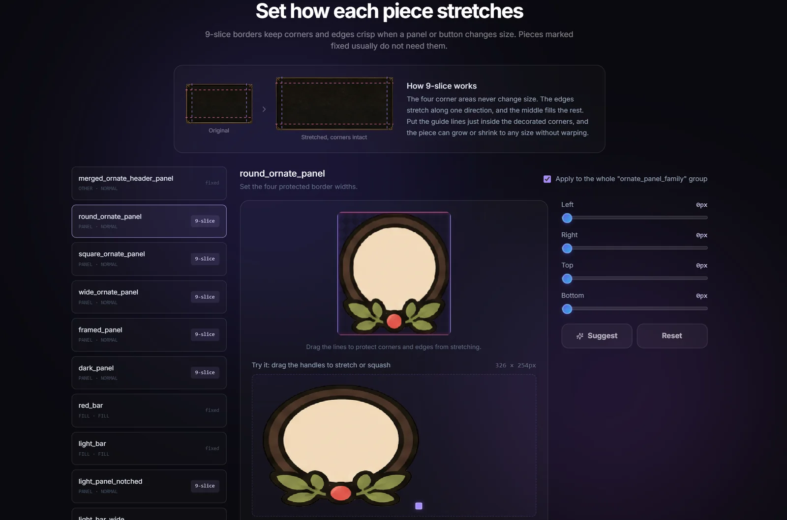
Pieces marked fixed, like icons, usually don't need borders. You can skip them.
Export and keep building
Every element is saved to your library with its name, states, and borders, and the kit downloads as an import-ready package. All three formats include the concept image as a layout reference, which is handy when a coding agent implements the screen for you.
- • ZIP / Web: individual PNGs, a packed atlas with JSON, the 9-slice manifest, and a loader example. On every plan.
- • Unity: a .unitypackage with sprites, stable state groups, borders, and an importer script.
- • Godot: PNGs, StyleBoxTexture resources with your reviewed margins, and Theme mappings.
The Unity and Godot exports are available on the Starter plan and up.
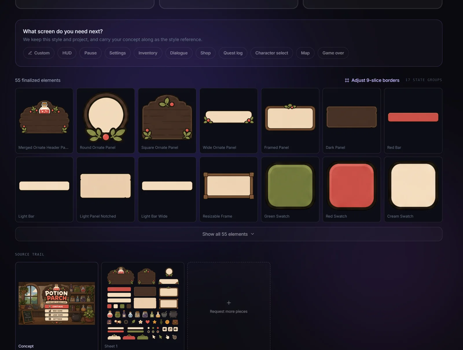
A finished kit stays workable
Kits usually aren't done after one pass, so the finished screen keeps three doors open:
- • Request more pieces. Ask for anything the kit is missing, based on the concept or on one of its sheets ("more buttons like these"). Your finished pieces stay; a new sheet is generated in the same style and merged in.
- • Adjust 9-slice borders. Reopen the border editor for any element, straight from the element grid. Saving updates the kit in place without re-cutting anything.
- • Build the next screen. One click starts the pause menu, settings, or HUD for the same game. The new kit reuses your style and project, with the finished concept carried along as the style reference, so a whole game's screens stay in one family.
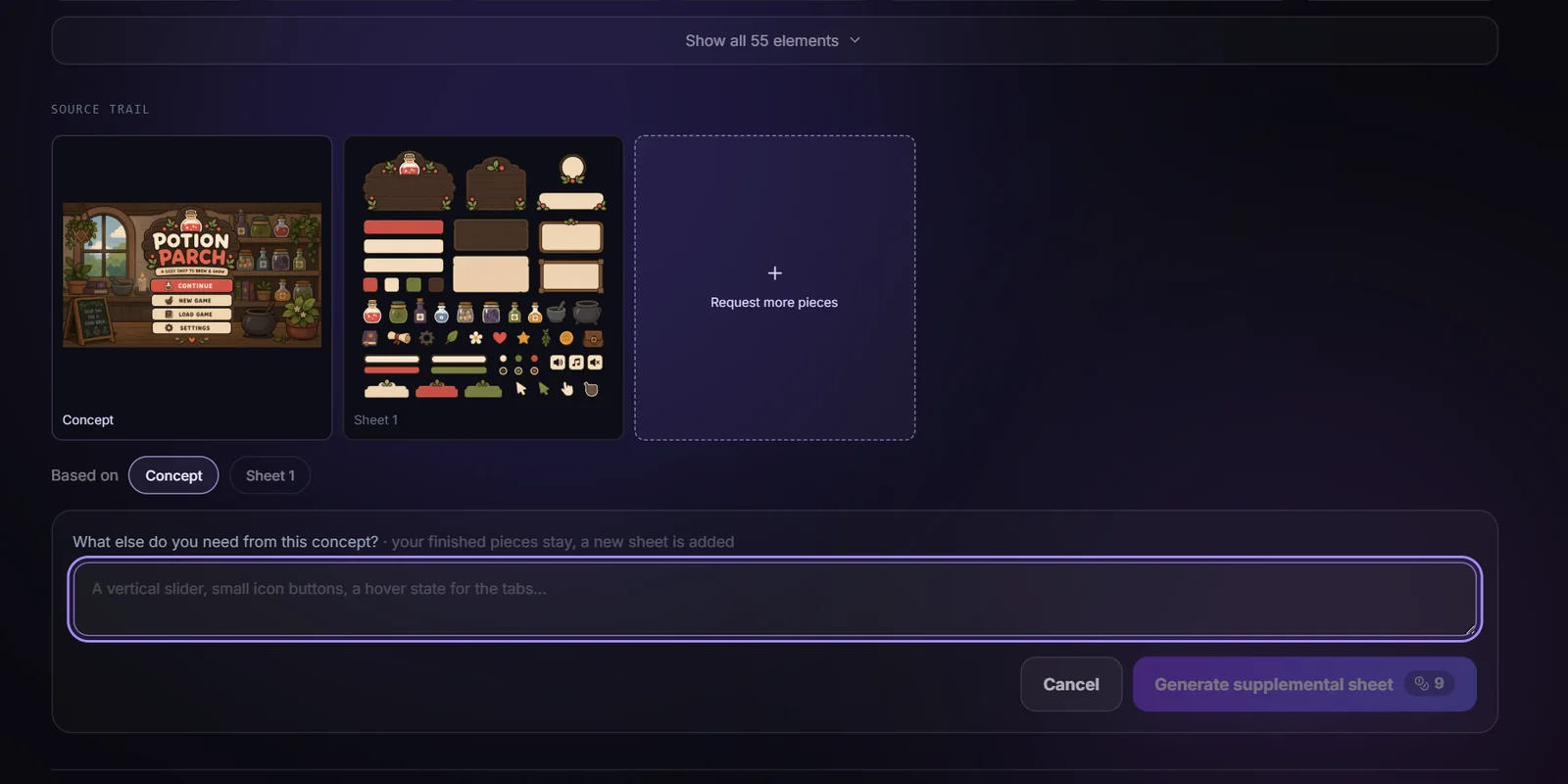
What it costs
Concepts are priced per image and component sheets per sheet, including background removal. Slicing, naming, 9-slice borders, and exports are free. Every button that spends credits shows its exact cost before you click, and failed generations are refunded automatically.